How Does Insurance SEO Different from Others?
Since I have been working on some insurance projects, I think now might be the perfect idea to cover content on this subject since insurance sites are also considered YMYL sites. One of the big differences I found is that, unlike medical sites, insurance broker or agent sites are usually more time-sensitive, which means they are tied to both events and seasonality since most the people acquire insurance only under certain periods or triggered by conditions, unlike medical sites where people will have search queries much more often because most of the time they are just looking for self-remedy only. In order to match up the insurance seasonal SERP, you will need to plan all your content much more ahead because SEO will usually take months to see the final results.
Can COVID-19 Impact Insurance SEO?
Focus on the events, by taking COVID-19 as an example, people are more looking into insurance options nowadays because most of them are unable to cover medical expenses in case they got infected, so having a proper insurance option that suitable to their needs will be extremely helpful. In addition, since insurance in the United States do have their “open enrollment period“, which means people will need to enroll their insurance plan starting from Nov (some states are different), by understanding detail info like this, it will be much easier for you to have content that especially tailors to these topics. In this blog, we will cover the insurance SEO tactics specifically match to the United States in order to show complex procedures of how to build SEO structures for most insurance sites.
What Elements Are Important for Insurance Site?
In the following, you will see what I think are the most important to improve the site’s UX as well as search volume:
- Focus on CTA content
- Focus on content creation with precise policies and rules regulation
- Focus on the GEO location page
- Focus on keyword research
- Focus on affiliate brokers and agent’s sites and external links
- Having terms & conditions as footers on site

Enhance Conversion Rate with CTA
Unlike e-commerce sites, lots of the time site uses “push marketing strategy” by suggesting products by pushing a sense of urgency to users such as having a discount as well as coupon code to trigger sales from the customers, however, in the insurance world, the concept is very different because customers are usually “pulling” info from the site by inputting search keyword, it can be a health insurance plan, a company or specific term that will induct actions, and that is why we should always have “call of action” content on each page because we know that customers are entering to the site with a strong intention of looking for insurance plan or deals that only work for them, so CTA will play an important role to close the end of the sale funnel.
- Having a telephone line as prominent as possible on the site
- Offering a “freemium” type of services on the main page
- Having a contact form on every page to acquire customer inquiry information
Make Sure You Track the Conversion Properly
Unlike other industries which uses revenue tracking, insurance often use “lead generation” to calculate their performance, so having a tracking system such as tag management, Google analytic or Ringba are handy for further analysis, and that is why earlier I recommended to have “telephone” to be placed as prominent as possible on-site, we can always use some dynamic phone tracking plugin (Pretty much like Google ads) to ensure that we will be able to track all the number of calls. Also, we can set up goal completion through Google analytic to get a better idea of how many people have completed filling forms from the site.
Offering Competitive Services to Your Clients
It is very important to offer incentives to your audience about your services so to ensure you will be able to stand against to your competitors, having terms such as “Get Free Quote Today” are extremely helpful, and you can also have this button tracked by implementing event or tag management tracking..etc
Content Creation Guideline
- Understand your Jargons
- Understand the new law regulations and policies
- Types of insurance type pages
- Types of insurance carrier pages
- Service pages with Geo-target pages
- Having infographic or visual chart
1) Understand Your Jargons
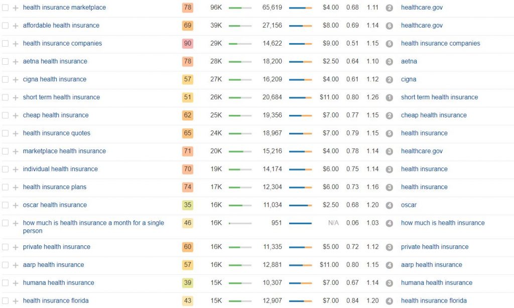
Similar to medical content, to create insurance site content requires a longer learning curve than others, this is simply because the complex structures of the insurance world, and this is definitely not something that the government or insurance companies are willing to make it crystal cleared to everyone. Having some in-depth knowledge related to term such as “Open Enrollment Period“, “Obamacare“, “Affordable Care Act“, “Cobra Insurance” or “Healthcare Marketplace“, “Trumpcare” will be definitely helpful since most of the topics will be derived by these core main terms.
2) Understand the New Law Regulations and Policies
One thing that I have to admit that insurance content management is pretty much pain in the ass, because lots of the content that we build are highly volatile, what does it mean? It means we will always need to revamp the content whenever there are law regulations and policies kick in, sometimes the rules or regulations won’t apply anymore and then we will need to remove the content before submitting outdated information to Google, having incorrect information will definitely affect your EAT score, the battle between “Obamacare vs Trumpcare” can be a perfect example since the new rule can change things dramatically, so we always need to keep an eye on these important details.
3) Having Types of Insurance Product Pages & Carrier Pages
These two categories are perhaps the most searched query types, we need to make sure to cover keyword with intent such as “what are group insurance”, “family insurance” or carrier pages queries such as “BlueCross health insurance”..etc to get the max visibilities as you can from SERP.
4) Geo-Target Pillar Pages
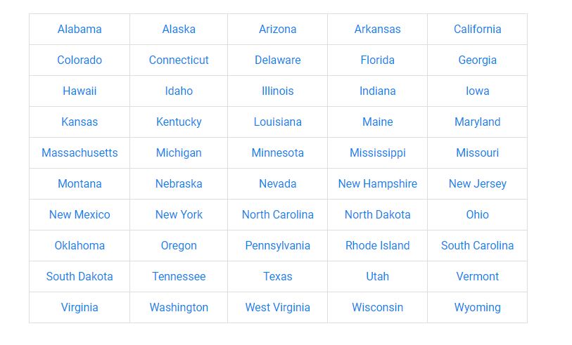
Since most insurance plans vary across different states, hence, it is extremely important to cover all the “GEO” pages with cleared local insurance policies as possible, having all the benefits & comparative quote info will definitely help audiences to sound proper decision based on the plans and the places where they located.
5) Having Infographic or Visual Chart
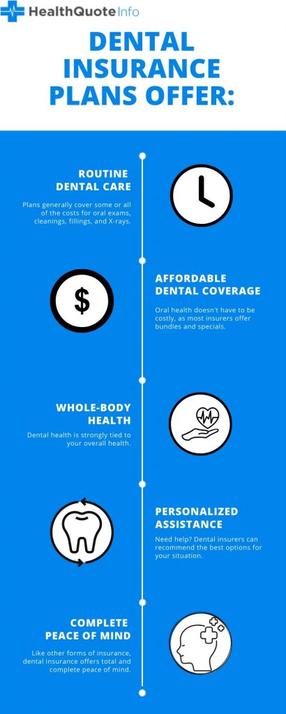
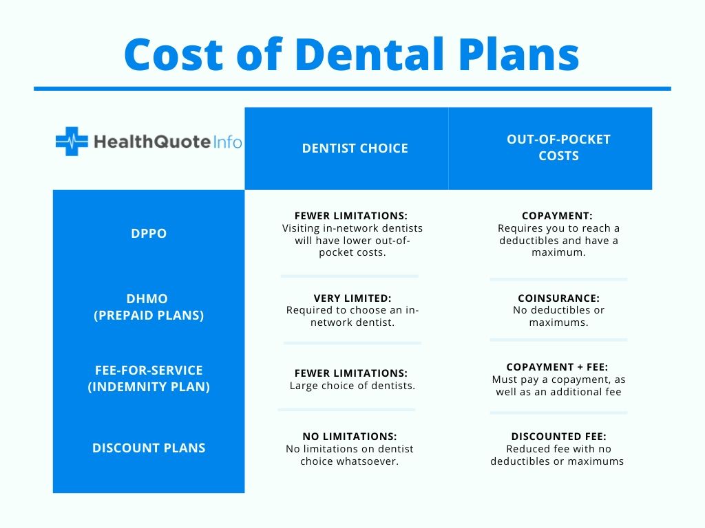
Having cleared charts as well as infographic for explaining the complex system of insurance products, rules and regulations will be other helpful tactics to create unique selling proposition to your audiences since not all the people want to spend all day just to read your context. In addition, having your own infographic, as well as a visual chart with pricing and services will be also beneficial to your image search SERP.
Link Building Tactics: Affiliate Brokers & Agents Sites External Links
It is always good to include affiliate brokers or Government links into your insurance content, the external linking opportunity will help you to increase your authority score by having pages such as health insurance org or healthcare gov on your insurance service content. As we all know that insurance brokers or agents are usually liaison between the insurance companies and customers, add all the carriers site URLs into your content will build a solid structure of insurance web site. In addition, adding up some backlinks from the insurance company review sites are sometimes handy to help you to rank up the site quickly.
UX Friendly – Dynamic CTA Banner with Auto Zip Code Detection
This part might not be necessary for all insurance sites, but I do think this is a very interesting feature that will drive customers faster to convert, and the reasons are simple, it’s convenient and all-in-one, since we can implement this type of banner across each page and implement as a shortcode, you just need to drag & drop from site’s CMS editor that is it, and since customers usually do not prefer to spend their time to select their “states” in order to get quote information, it will be better if we can cover all of these at once to solves the hassles from the customers. With a better UX structure, such as colour, navigation menu as well as convenient page layout, it will enhance the overall conversion rate from clients perspectives.
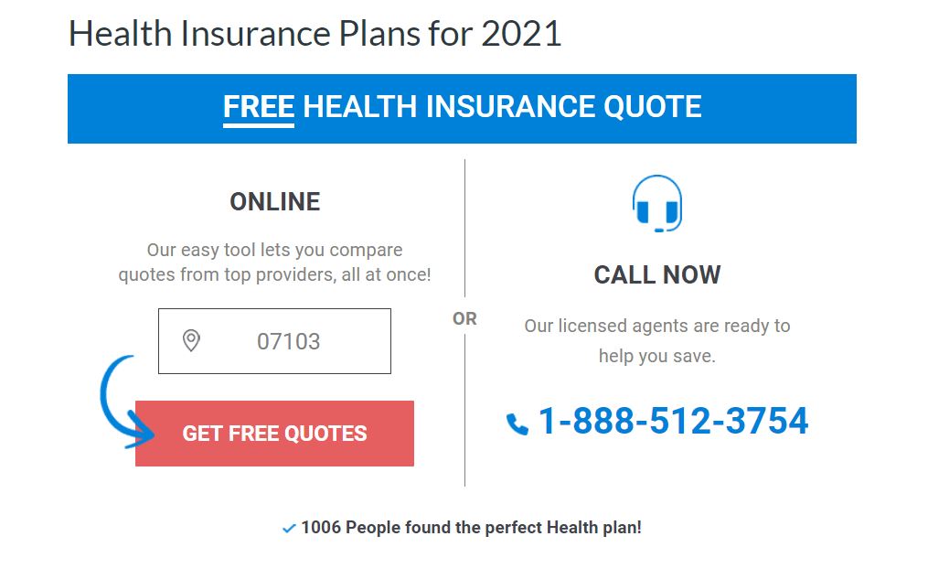
In order for clients to choose their desired health plan, they will need to spend lots of time reading info online, so the quicker way that you help your clients is to help them to find their desired content, the easier that they find than the higher chance that this deal will be converted, so in addition from the previous content we talk about how to leverage infographic and CTA to make them understand products and services quicker, we can also add a table content or breadcrumb trails to facilitate the navigation barriers from the clients’ points.
